Ucommerce widget style sheet
This article will teach you how to create widgets with the right look and feel following the style guides of Ucommerce. Following those will allow you to style widgets once and they will work across all CMSes.
Each widget has a content area where you have full control of what's inside. The area available is defined in the image below.
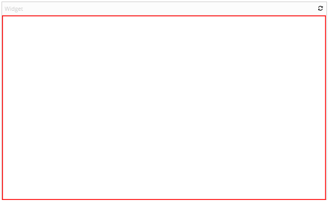
All widgets are resizeable. It is important to keep that in mind when designing your widgets. Otherwise, you might end up in a situation where the widget doesn't work well when the content area is small or big.
All dashboards will have a calculated width based on the content area available on the screen. It will be divided into a grid of x times x tiles depending on the screen size where each tile are 100px in width and height. This means that the size of the widgets will be reliable even though the size of the screen varies.
Lists
Vertical List
| Tag | Description |
|---|---|
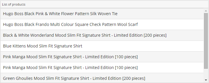
| dataList | Look and feel for a list of items |
Example:
        <ul class="dataList">
          <li>
              <span>
                Hugo Boss Black Pink & White Flower Pattern Silk Woven Tie
              </span>
          </li>
          <li>
              <span>
                Hugo Boss Black Frando Multi Colour Square Check Pattern Wool Scarf
              </span>
          </li>
        </ul>
Result:
Horizontal List
| Tag | Description |
|---|---|
| tags | Show a horizontal list |
Example:
        <ul class="tags">
          <li>
              <span>
                Ucommerce
              </span>
          </li>
          <li>
              <span>
                uConnector
              </span>
          </li>
        </ul>
Result:

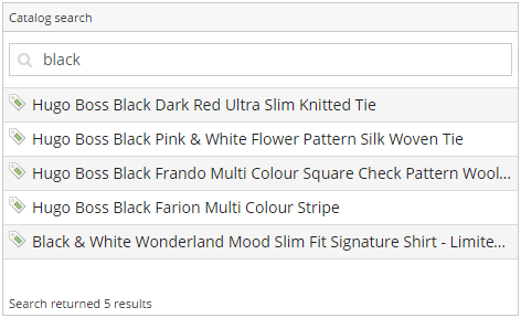
You can find more inspiration by looking at the Catalog Search widget.
Table
| Tag | Description |
|---|---|
| dataList | Give the right look and feel for a table |
Example:
        <table class="dataList">
          <thead>
            <tr>
              <th>ORDER NUMBER</th>
              <th>ORDER TOTAL</th>
            </tr>
          </thead>
          <tbody>
            <tr>
              <td>100001</td>
              <td>289</td>
            </tr>
            <tr>
              <td>100002</td>
              <td>1785</td>
            </tr>
          </tbody>
        </table>
Result:
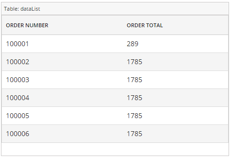
You can find more inspiration by looking at the Orders widget.
Edit mode
| Tag | Description |
|---|---|
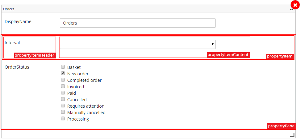
| propertyPane | Contains a list of properties to edit |
| propertyItem | Each property with label and field |
| widgetProperty | Contains the specific property |
| propertyItemHeader | The label text |
| propertyItemContent | The input wrapper |
Example:
        <div class="propertyItem" >
            <div class="propertyItemHeader">
    			<span class="widgetPropertyLabel">Input Field</span>
           </div>
            <div class="propertyItemContent">
    			<input type="text" class="no-margin" />
    		</div>
        </div>
Result:
Inputs
multiSelect
| Tag | Description |
|---|---|
| multiSelect | Show a multi-select list of input types as checkboxes |
Example:
        <div class="multiSelect">
          <label>
            <input type="checkbox">
            <span>Basket</span>
          </label>
          <label>
            <input type="checkbox">
            <span>New Order</span>
          </label>
          <label>
            <input type="checkbox">
            <span>Invoiced</span>
          </label>
        </div>
Result:
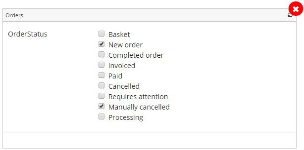
You can find more inspiration by looking at the orders widget edit page.
Searchbar
    <div class="searchHeader">
    	<div class="searchInput">
            <i class="fa fa-search"></i>
    	    <input type="text" placeholder="Type to search...">
    	</div>
    </div>
Result:

Outputs
Text with no wrapping
| Tag | Description |
|---|---|
| oneLineText | Text on one line and replace overflowed text with '...' |
Example:
        <span class="oneLineText">
    		Your awesome text.
    	</span>
Result:
Scaleable text
If you want a header or similar that scales with the size of the widget you can use a directive called <ucommerce-resizable-text> that will resize the text on load based on the size of the parent. Please note that the font size will be calculated based on the text and number of characters which makes it bad for paragraphs or in a list. It should only be used for headers or similar.
    <div>
    	<ucommerce-resizable-text text="Some text that scales"></ucommerce-resizable-text>
    </div>
Fixed table header
If you want fixed sizes for each of your columns in your table, you can use the fixedHeader class on your table. Besides that, you can decorate each with the property data-width that takes a percentage width you want for each column.
        <table class="dataList fixedHeader" id="orderTable">
          <thead>
            <th data-width="30">
              Header01
            </th>
            <th data-width="40">
              Header02
            </th>
            <th data-width="40">
              Header03
            </th>
          </thead>
          <tbody>
            <tr>
              <td>Cell01</td>
              <td>Cell02</td>
              <td>Cell03</td>
            </tr>
          </tbody>
        </table>
The example above shows you how to set up the table.
In your controller, you need to call the following to have the table size calculated properly. The UcommerceWidgetTableService can be injected in your controller.
UcommerceWidgetTableService.recalculateTable($scope.elm.find('#orderTable'));
The UcommerceWidgetTableService takes in the element and will calculate the width for the cells on the given data-width specified in the column header. Please note that you can access the element of your widget with the property 'elm' on the scope and use that as the base for your query to find the specific table element:
$scope.elm.find('#orderTable')
The fixedHeader styling class makes the header fixed and the body scrollable so your headers will remain fixed even if the amount of data requires a scrollbar.
